
You are working on a local quality improvement (QI) project aimed at improving emergency department (ED) lab test turnaround time. You started with a period of stakeholder engagement including the nursing staff, physicians, porters, administrators, clinical biochemists, lab technologists, and patients. Your team completed a root cause analysis and several potential interventions were highlighted. Your team decided to utilize a Plan-Do-Study-Act (PDSA) cycle approach to carry out several interventions including implementing a new labelling system for STAT, i.e. statum or immediately needed tests, a separate entry on the Lab Information System (LIS), and updated STAT labeling for lab test couriers from the ED to the Lab.
Your team created a project charter and decided on the following family of measures:
- Outcomes Measures: Lab test turnaround time for STAT tests (order entry to order appearance on the electronic healthcare record).
- Process Measures: Number of patient samples collected.
- Balancing Measures: Lab test turnaround time for non-STAT tests, number of lost samples, number of incorrect entries on LIS
You began collecting data and plotting on run charts to better visualize signs of improvement. You start to wonder how to best display your data, and how to display the different family of measures.
Welcome to another HiQuiPs post, and part-two of our series on reporting QI results. In our last post we introduced run chart utility, how they are constructed, and their probability-based rules. In this post we continue our discussion of run charts with important considerations, common pitfalls, and expanded uses.
Run Chart Considerations
One main consideration when beginning to formulate a run chart is how many data points are needed to create a run chart. QI methodology reflects a pragmatic approach to collecting data from a healthcare process that is ongoing and usually dynamic. First, if the team plans to use probability-based rules (i.e. rules 1-3 from our previous post), then a general consideration is to use a minimum of 10 data points over the data collection period. This should ensure an adequate median is calculated for the probability based rules1. Other considerations for minimum baseline data points for a run chart are illustrated in Figure 1.
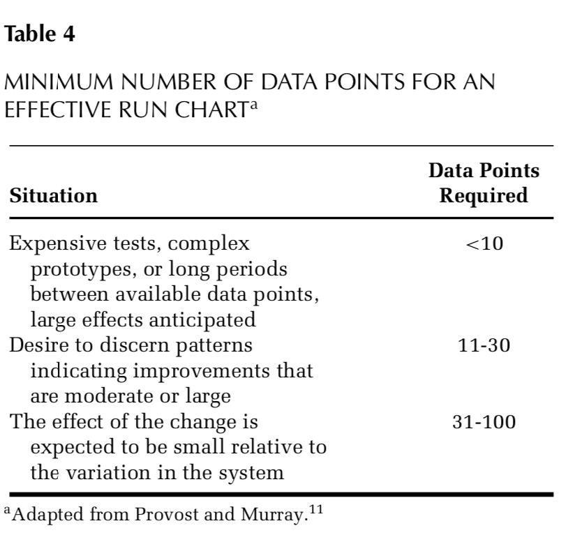
The next consideration is the sample size of the data point. The larger the same size (i.e. average turnaround time for 1 hour of STAT tests vs 1 week of STAT tests), the more precise the data point is2. However, there needs to be a balance between how precise and how practical (i.e. cost, resources, time, etc) the approach is3. The QI pragmatic approach may may require a smaller sample size than classical research methodology with specific a priori statistical significance needs.
With classical QI data collection, utilizing a family of measures ensures that a more complete view of the system is measured while the intervention is taking place. Therefore, getting samples across a wide range of conditions is favoured over more samples collected under one specific condition2. For example, obtaining measurements at different times of day, days of the week, shifts, providers on duty, or locations (e.g., resus room vs. fast track) may help create a more holistic picture of the system and change taking place (or not!). This is also handy when looking to stratify the data (more on this later).
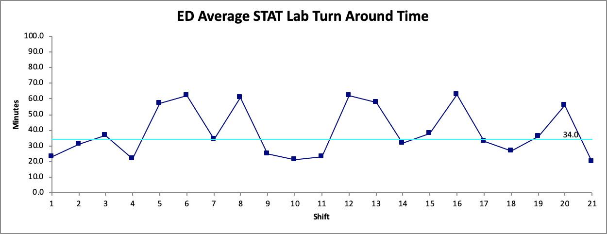
Another important consideration when creating the run chart is which points to use to create the baseline. This baseline (group of data points that will be used to calculate the median) will have an effect on the probability based rules that will determine if there is a signal of change. Therefore, it is important to ensure that the baseline points do not show a signal of change in themselves. For example, in Figure 2. the first 7 points noted in the process show a signal of change based on the probability-based rules (the number of runs in this case).
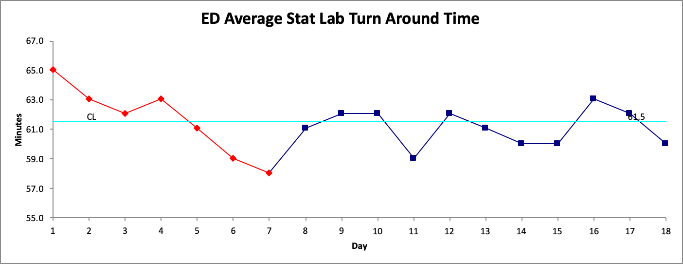
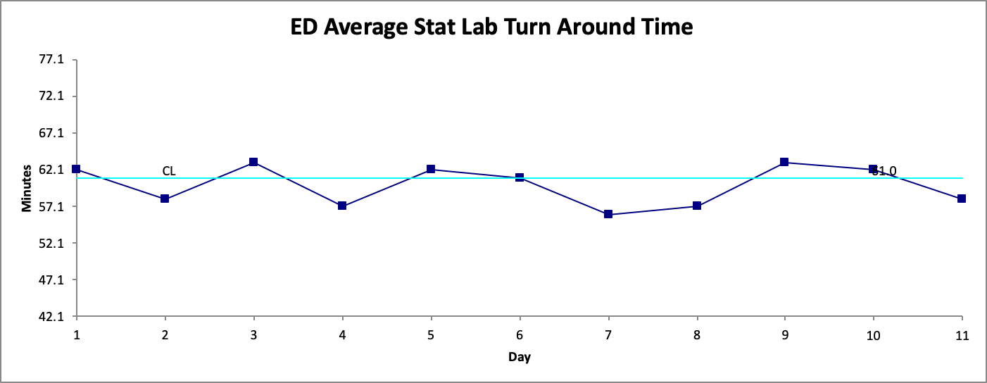
Since Figure 1. has a signal for change during its baseline period it would not be ideal to use when determining the effect of our intervention. A general approach is to simply move along the data points (if there sufficient data points available) and start the baseline from another point. In this example we start from Day 8 (in Figure 2. ) as our new start date, and calculate a new baseline median. This is illustrated in Figure 3.
Common Pitfalls:
Run charts, like any other tool we use, have their limitations2. One main element is that they are constructed in order to detect signals of change (good or bad). They are not designed to detect if a process is stable. Our previous post discussed process variability with examples of common cause and special cause variability. Common cause variability is variability that is inherent in the process itself. A process with only common cause variability is a stable process. There are statistical tools to help us understand how much ‘variation’ is still considered stable in a given process4. Run charts do not have the capability of detecting this information. However, Statistical Process Control (SPC) charts, i.e. Shewhart charts, are designed for this purpose.
Run charts also necessitate the use of content or process expert judgement along the entire process. This echoes with the importance of key stakeholder engagement. Process experts are needed for decisions which include data collection and sampling, data presentation and interpretation. QI methodology is based on real-world application of data with the absence of tight control of variables typically used in classical research methodology. Therefore, the effects of other potential confounding processes need to be considered when interpreting the data. This is also another reason why a family of measures is needed. Having your finger on the pulse of a different measures allows you to understand how they relate to each other and what else is changing, as opposed to just one measure in isolation that may not have changed for the reasons you thought or even related to your project.
Finally, caution should be exercised in two situations. First, is when using discrete data (for example all or nothing (0% or 100%) as the median calculations do not apply. Discrete data such as this can be presented in other ways (discussed in a future HiQuiPs post). Second, is using rates (i.e. x/y, or different sample group sizes for example data points being: 3/10, 4/12, 5/16, etc.)1. This type of data should only be used in run charts if the denominators are within 25% (+/-25%) of the average denominator size for the data points. If there are larger shifts in the denominator sizes, then interpretation of the chart may imply false signals of change. If the denominator sizes vary more than 25% of the average denominator size, then SPC charts should be used.
Expanded Uses:
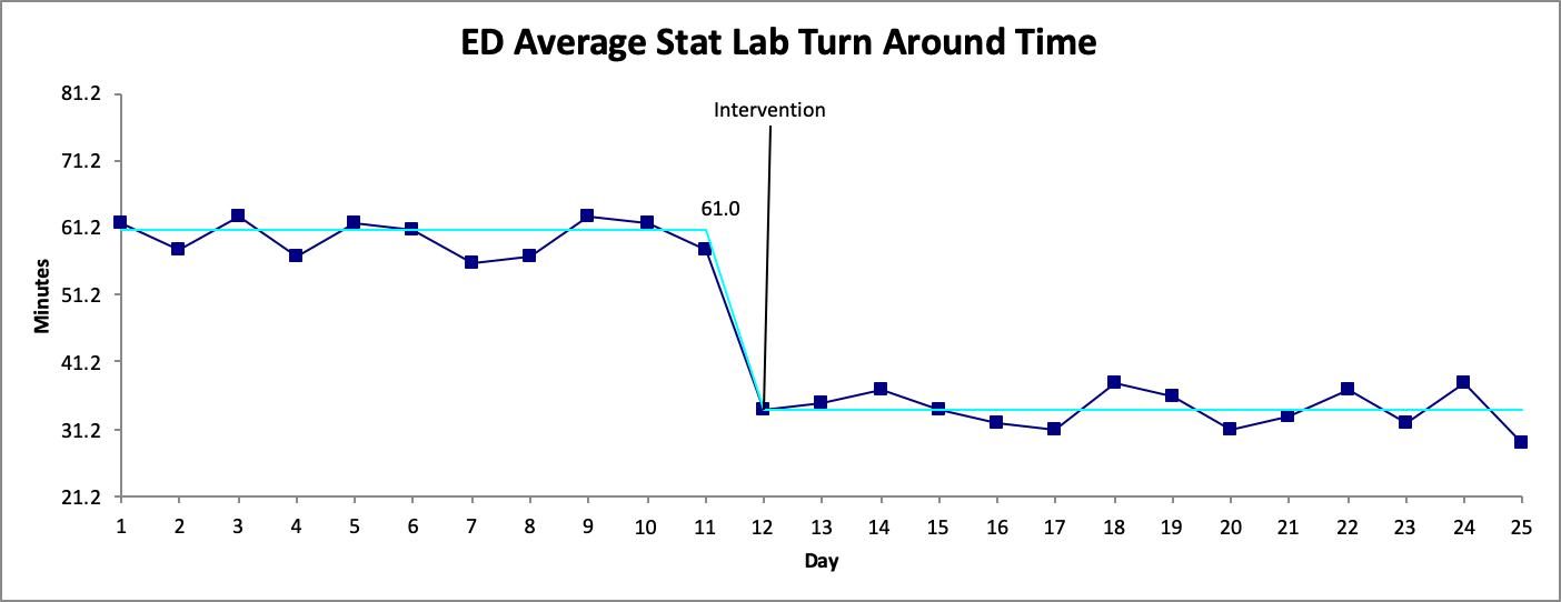
In many QI projects, a run chart begins to be populated with the first data point and extended into the future as more data points are collected. After sufficient points (generally 10 or more as discussed above) probability-based rules can be used. One elegant visual display is of a process change is re-calculating a new median. Figure 4. illustrates this point by showing a process change through recalculating the median.
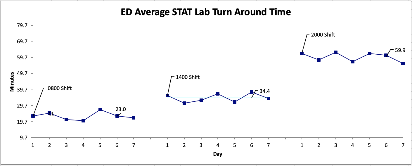
If you recall from the previous post, the strength of the run chart lies in its graphical display of processes. Showing a process change with different medians is one way to capitalize on this strength. Another way to use this strength is to stratify the data that is collected1,2,5. As mentioned above, getting samples across a wide range of conditions is favoured. For example, Figure 5a shows the same data displayed for the overall process, then displayed by shift in Figure 5b. It is more apparent where the focus of the intervention could be. This is also another important reason for process experts to be involved in determining which stratification approach is most ideal for the data.
That is it for our discussion of run charts. We hope you have learned a basic approach to utilizing this powerful tool, how it can guide your thinking about your family of measures, and how the data will be collected and displayed. Parts 3 and 4 of this series on Reporting QI results will tackle Statistical Process Control (SPC) charts. However, for our next post we switch gears and go back to basic principles where we discuss the differences between classical research and QI methodology. See you next time!
Senior Editor: Lucas Chartier
Junior Editor: Mark Hewitt
Copyedited by Mark Hewitt
**UPDATE (November 2020): The HiQuiPs Team is looking for your feedback! Please take 1 minute to answer these three questions – we appreciate the support!**
- 1.Provost L, Murray S. The Healthcare Data Guide: Learning From Data For Improvement. 1st ed. San Francisco: Jossey-Bass; 2011.
- 2.Perla R, Provost L, Murray S. Sampling considerations for health care improvement. Qual Manag Health Care. 2014;23(4):268-279. doi:10.1097/QMH.0000000000000042
- 3.Perla R, Allen B. Balancing cost and precision in hospital accountability sampling. J Healthc Qual. 2011;33(3):5-9. doi:10.1111/j.1945-1474.2010.00106.x
- 4.Mohammed M, Worthington P, Woodall W. Plotting basic control charts: tutorial notes for healthcare practitioners. Qual Saf Health Care. 2008;17(2):137-145. doi:10.1136/qshc.2004.012047
- 5.Siriwardena A, Gillam S. Measuring for improvement. Qual Prim Care. 2013;21(5):293-301. https://www.ncbi.nlm.nih.gov/pubmed/24119515.

Cori Atlin
Latest posts by Cori Atlin (see all)
- Reporting QI Results Part 2 – Run Charts - December 11, 2019
- HiQuiPs: Implementation Part 2 – Which Strategy to Choose: PDSA, Lean, or Six Sigma? - January 4, 2019
- HiQuiPs: Preparation Part 3 – Root Cause Analysis - November 2, 2018

Ahmed Taher
Latest posts by Ahmed Taher (see all)
- HiQuiPs: Managing Crises – What’s going on behind the scenes? - June 4, 2024
- HiQuiPs: Root Cause Analysis in the Time of COVID-19 - May 14, 2024
- Expert’s Corner – Dr. Eddy Lang on Quality Improvement and Healthcare - July 29, 2021