Your meeting with hospital stakeholders on designing a dashboard to better care for COVID-19 patients who are experiencing homelessness was a resounding success. Everyone was engaged and helped craft a problem statement, KPIs, and OKRs that you then presented to your hospital IT team. Luckily, IT has the bandwidth available to support developing this dashboard—but they need your help through the process.
In today’s post, we’ll go over the second phase of designing and developing a dashboard to solve a real-world clinical and QI challenge. This post covers functional and non-functional requirements as well as design principles of effective dashboards. As with the other posts in our series, this post draws on Unity Health Toronto’s Data Science and Advanced Analytics (DSAA) team’s work developing a dashboard to care for COVID-19 patients experiencing homelessness as a running example.
“[My favourite part of the project] has been meeting all the different end users… it’s a very large group actually… there’s a mix of roles… being able to work with them, meet new people, and then they also all have different needs… learning more about that has been really interesting.” (Rebecca Lin, Research Coordinator, DSAA, Unity Health Toronto)
Functional and Non-Functional Requirements
In our last post, we identified the core problem we wanted to solve with our dashboard, as well as objectives and key results (OKRs) and key performance indicators (KPIs). The next step is to determine a set of functional and non-functional requirements. Gathering these requirements involves a detailed needs assessment with intended users to understand their current workflow and how the dashboard can fit within that workflow.
Functional requirements are the specific capabilities or features that a software system must have. They convey what the software must do. Common functional requirements in clinical dashboards include measurement of KPIs, alert creation, customization, and tracking.1 Functional requirements are the “need to haves”.
In contrast, non-functional requirements are limitations or constraints that the software satisfies. Non-functional requirements impact the overall quality and performance of the software system. Common examples of non-functional requirements include: speed (e.g., dashboard loads within 5 seconds), security, number of concurrent users supported, ease of use, and compatibility with mobile devices.1 Non-functional requirements are the “nice to haves”.
Surveys, semi-structured interviews, and focus groups are all commonly used to gather requirements. While surveys are often the easiest to conduct logistically, the discussion fostered by interviews and focus groups can help users uncover and challenge assumptions that may ultimately impact use. A helpful activity to consider in a focus group is card sorting, where users create and organize functional and non-functional requirements. This activity can guide users in prioritizing dashboard features, which can be tracked in a priority matrix (e.g., 2×2 of usefulness and feasibility) or through simple up-and-down voting.2 Tools such as Miro can facilitate focus group activities such as card sorting virtually.

Design Characteristics of Effective Dashboards
Below we outline five design characteristics of effective dashboards. Across all these principles, designers should ask if the dashboard effectively brings appropriate situational awareness to users–if not they run the risk of their efforts resulting in background noise, or worse a harmful distraction.
1) Display information based on your intended audience and purpose
Dashboards are often categorized into types by audience: operational, tactical, and strategic.3Operational dashboards are most commonly used in clinical environments and they tell users (e.g., staff currently working in the emergency department) about current performance using real-time or near real-time data. Operational dashboards also may notify users when KPIs exceed a significant threshold with quality or patient safety implications (e.g., wait times or capacity beyond safe limits). Tactical dashboards help identify trends in KPIs over time and are used by managers to make adjustments to improve performance in the medium-term (e.g., week-over-week). Strategic dashboards are meant to guide longer-term (e.g., quarterly) planning and monitoring of the entire organization’s performance.
The KPIs you have previously identified are often of interest to multiple audiences but on different timescales. For example, if a KPI is the number of individuals experiencing homelessness in the ED, operational users likely want to know the current number whereas tactical users may want to see a weekly rolling average. Customizing how KPIs are aggregated can help align what is displayed on your dashboard with your audience.
2) Organize information based on priority and similarity
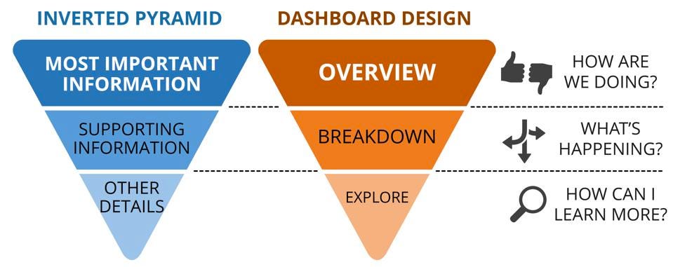
You can think of dashboards as a series of “cards” on a grid. The cards can be different sizes and each contains one metric or KPI as a figure or a table. The most important information (e.g., crucial KPIs like crowding or wait time) should be placed in the upper left-hand corner to get a user’s attention first. Metrics that provide context around these core KPIs and then other information are then placed underneath in an “inverted pyramid” format. Metrics should be grouped together to help minimize cognitive load.

3) Pick the right visual depending on the type of data you have
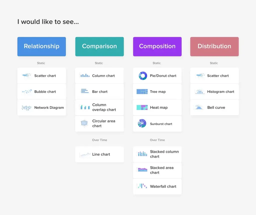
There are five main types of visual elements on a dashboard that convey KPIs: relationships, comparisons, compositions, distributions, and status indicators. There are best practices for designing each visual that are described at length elsewhere.4 It may also be important to present a KPI over time. Temporal trends in KPIs can be represented with a simple indicator (e.g., are wait times trending up or down within the last 3 hours?) or with a line chart or stacked chart. Understanding user needs and how they intend to leverage the dashboard in decision-making can help determine the right level of granularity for presenting temporal data. Status indicators, such as gauges, have been long used in dashboards and are the subject of considerable debate. They can quickly convey ordinal data (e.g., are things good, so-so, or bad) especially when paired with intuitive colour schemes (e.g., red, amber, and green) and may be well-suited for the top-left sections of operational dashboards. However, they do not facilitate easy comparisons or show trends over time so use them carefully!

4) Minimalism, simplicity, and effective use of colour build clarity
Ideally, users should be able to identify the most important takeaway from an operational dashboard within 10 seconds. Too much information and clutter actively detract from this goal. Colour theory and white space not only contribute towards an aesthetically pleasing dashboard but can also make it easier to use. Separating different sections of the dashboard with white space can help with organization and providing white space around text and/or coloured graphics creates contrast and make them more easily readable. Rounding numbers and having short but descriptive labels (e.g., with units of measurement) also contribute to legibility and clarity. Grouping related visual elements by colour also contributes to organization. Red, amber, and green are often used on dashboards to intuitively convey status information; however, they may be confusing for individuals who are colourblind. Avoid using colours as the only way of conveying a piece of information. Accessibility standards such as the Web Content Accessibility Guidelines can help designers pick colour schemes that are tested and effective for a wide range of people with different abilities and disabilities.
5) Design alerting to prevent fatigue
Alarm fatigue occurs when professionals are less likely to accept and act on more frequent or repeated alarms–especially from the same patient or process.5 Dashboard designers should only create alerts for the most important cases and think carefully about appropriately timing them. For example, if an alert is created 15 minutes after each test is ordered with the hope of accelerating workflows there would be far too many alerts and end users would likely be irritated if not irate. However, designing alert times around quality and patient safety standards (e.g., medical imaging not reported after 2 hours) increase alert relevance and impact. Finally, there should be a clear workflow to act on triggered alerts.
Wrap Up
You begin organizing a card sorting activity with stakeholders across the ED and IT to help finalize functional and non-functional requirements. An amazing project management intern will help you keep track of all documentation and soon you hope to have a design for your first prototype!
That’s it for the second post in our series about designing and deploying dashboards. We hope this gave you a good overview of gathering functional and non-functional requirements as well as design principles behind successful dashboards. Let us know what you think on Twitter at @Hi_Qui_Ps. If there is anything specific you would like to learn about, e-mail us at [email protected]. Stay tuned for our next post on how to go about building your dashboard!
Senior Editor: @shawn-mondeux
This post was copyedited by Sydney Terry.
- 1.Rabiei R, Almasi S. Requirements and challenges of hospital dashboards: a systematic literature review. BMC Med Inform Decis Mak. 2022;22(1):287. doi:10.1186/s12911-022-02037-8
- 2.Team Asana . Priority matrix: How to identify what matters and get more done. Asana. Published October 24, 2022. Accessed January 3, 2023. https://asana.com/resources/priority-matrix
- 3.Mieke H. Strategic, operational, tactical… what’s your dashboard type? . Cumul.io Blog. Published 2022. Accessed January 3, 2023. https://blog.cumul.io/2018/02/21/strategic-operational-tactical-dashboard/
- 4.Bakusevych T. 10 rules for better dashboard design: Practical Guide. UX Planet. Published July 17, 2017. Accessed January 3, 2023. https://uxplanet.org/10-rules-for-better-dashboard-design-ef68189d734c
- 5.Ancker J, Edwards A, Nosal S, et al. Effects of workload, work complexity, and repeated alerts on alert fatigue in a clinical decision support system. BMC Med Inform Decis Mak. 2017;17(1):36. doi:10.1186/s12911-017-0430-8
Reviewing with the Staff
Dr. Chartier is an emergency physician, and the VP, Quality and Safety at University Health Network.


